Cummins. 1962.
The word Cummins could have easily been drawn horizontally. Although it is still simple, the diagonal draws attention to the logo.

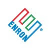
Enron. 1966.
This also has the diagonal, but in differ directions. The multiple colors in a single form brings this logo out even more.

United Parcel Service (UPS). 1961.
The simple notion of a bow on the gift box ties this logo together. With that the bottom shape doesn't look so much like a shield.


No comments:
Post a Comment